Designing an Infographic: A Deep Dive into the Cochin Typeface
Designing an Infographic: A Deep Dive into the Cochin Typeface
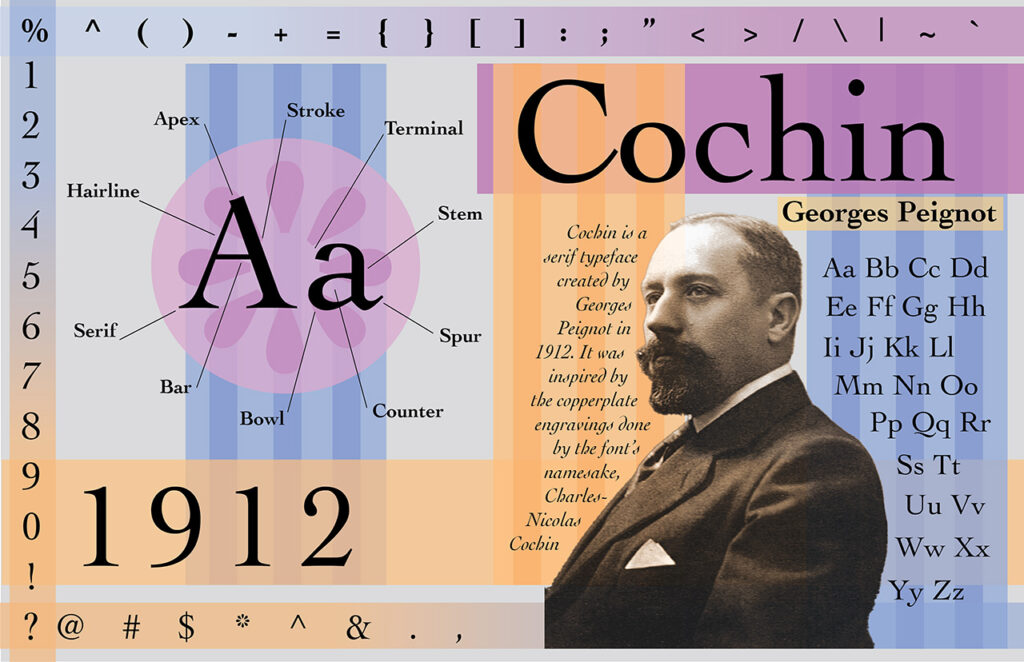
Cochin's Origins
In the world of typography, where letters are more than just symbols, Cochin stands as a timeless typeface. This classic font, with its graceful serifs and elegant curves, has a rich history dating back to the 18th century. Cochin is a serif typeface created in France in 1912 by prominent type designer, Georges Peignot. Peignot was looking to design a new typeface and was inspired by the copperplate engravings of the 18th century artist Charles-Nicolas Cochin, the font’s namesake. To pay homage to this typeface, I recently created an infographic that explores the origins of Cochin and its unique design characteristics. In this blog post, I’ll take you through the journey of designing this infographic and delve into the characteristics ofthe Cochin typeface.
The Anatomy of Cochin
When designing this infographic, I wanted to delve into the anatomy of the Cochin typeface, breaking down its elements to help the viewers understand how the typeface was designed. To do this, I included the uppercase and lowercase ‘Aa’ characters and labeled the key components in each letter.
Here's a breakdown of the labeled elements on the 'Aa' Characters:
Apex: The topmost point of a letter.
Stroke: The main vertical or diagonal line in a letter.
Terminal: The end of a stroke that doesn’t include a serif.
Stem: The vertical, full-length part of a letter.
Spur: A small, projecting curve or projection.
Counter: The enclosed or partially enclosed space within a letter.
Bowl: The curved and typically fully enclosed part of a letter.
Bar: The horizontal stroke that connects two stems.
Serif: The small decorative strokes at the ends of letter lines.
Hairline: The thinnest stroke within a letter.
This detailed examination allows viewers to appreciate the intricate design work and craftsmanship that Georges Peignot put into creating a typeface like Cochin.
The Full Character Set
To provide a comprehensive view of Cochin, the infographic showcases the full set of characters. This includes both uppercase and lowercase letters, as well as essential symbols and punctuation marks.I also included the bold, regular, and italic versions of the font. This allows the viewer to see the entire typeface and helps convey the versatility of it, highlighting its adaptability for various design projects.
Infographic Design Choices
By incorporating a photograph of Georges Peignot, the designer behind the Cochin typeface, I aimed to celebrate the artistry of those who have shaped the world of typography. The character set, featuring both upper and lowercase letters along with symbols, gives a full overview of the typeface.
I also decided to use bright colors and overlapping, transparent shapes to keep the viewer engaged. Using the symbols as a border also helped frame the entire infographic. My intention was to keep the design fun while also being informational, and I think I was able to achieve that.
The Cochin typeface continues to captivate designers with its classic elegance and timeless appeal. Through this infographic, I hoped to share the beauty and craftsmanship of Cochin while paying tribute to its historical roots. Whether you’re a typography enthusiast, a graphic designer, or simply someone who appreciates the artistry of fonts, Cochinremains a testament to the enduring legacy of classic design.